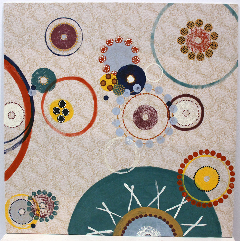
I continued to use the same circuclar idea in this piece. I added a shade of purple and decided to use fabric on top of the wood for something different. I like fabric in the background, it adds a different feel and texture to this piece as opposed to the others that I have done. The circles are fun to paint but I think I will go back to painting with watercolor inks like I have done in the past to work on my technique and painting more realistic objects.
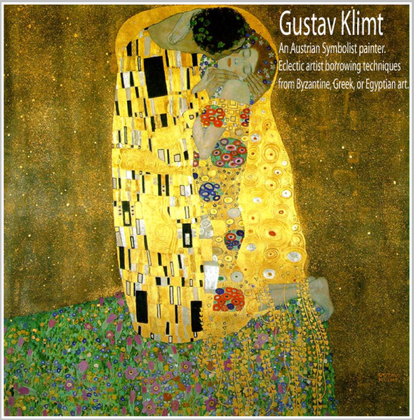
I decided to study Gustav Klimt because I am interested in his use of pattern. As opposed to the patterns in my work, Klimt’s eclectic style combining art from the Byzantines, Egypt, and Greece, caught my attention.
Gustav Klimt was one of the most influential artists of Art Nouveau, using impressionistic techniques. My favorite paintings of Klimt’s are the works of art that he created during the Golden Age. During this period, Klimt’s works consisted of patterns within patterns which then lead to some type of figure. I am interested in his use of color (mixing metallic paint with opaque) and his perspective of art. Gustav Klimt’s art is abstract and unique, it combines patterns and portraiture. I am interested in studying his work further to inspire my future pieces.
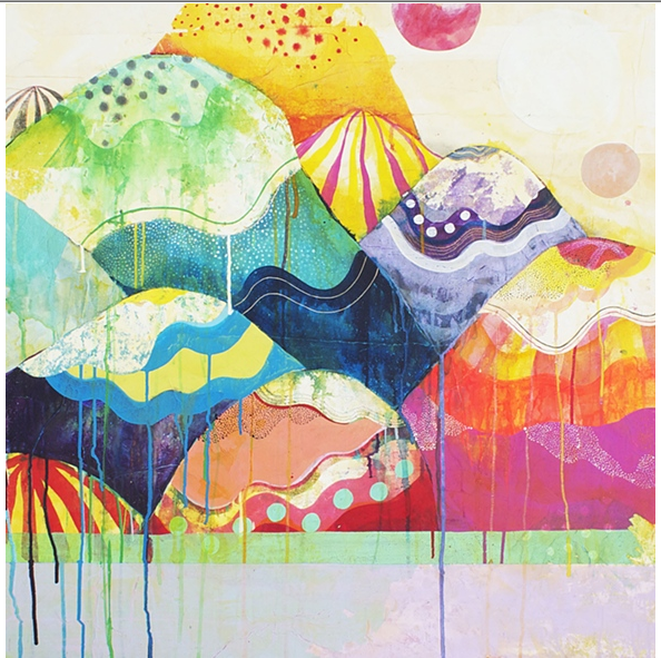
This piece consists of the similar radial shapes and color schemes as the previous two. However, I got a lot of feedback saying I should paint on wood to see how it looks with the wood grain showing through. Personally, I can’t tell which one I like better, the wood grain or the stark white paper.
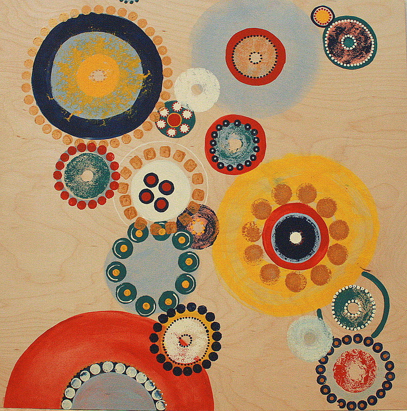
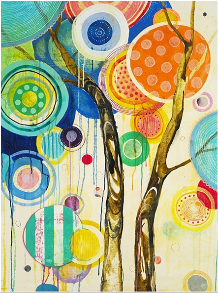
The smaller, more detailed circle shapes grabbed the most attention and they are more fun to create. In the next piece, I want to experiment using different fabrics along with acrylic paint for the intricate detail work.
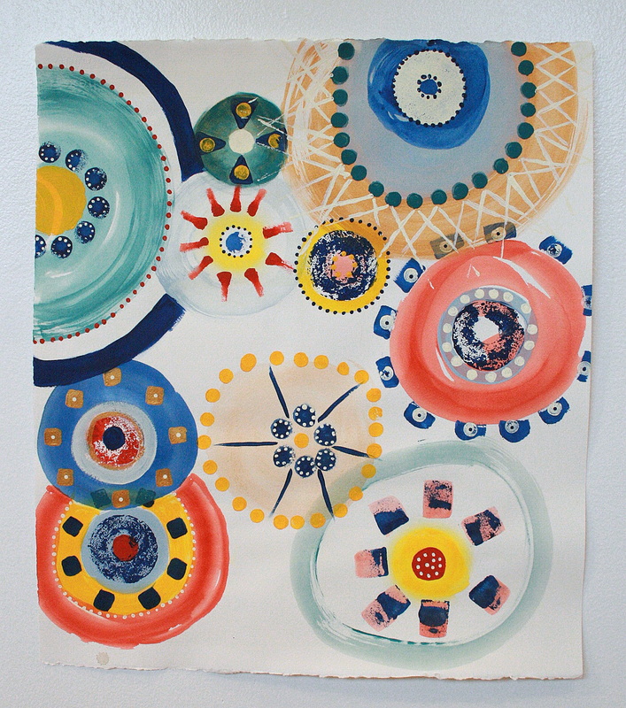
When creating this piece, I decided to take bits from the previous one that stood out. I kept the same basic color scheme, while making many parts more translucent. To me, this piece has a more feminine and playful feel to it which portrays my personality, and makes it feel more like “my work”.
The feedback I received was positive and many liked the wider use of color. Having this range of colors also helps when making the actual art. There are essentially the same amounts of colors, but there is more variety which makes the piece more interesting to look at than the previous one.
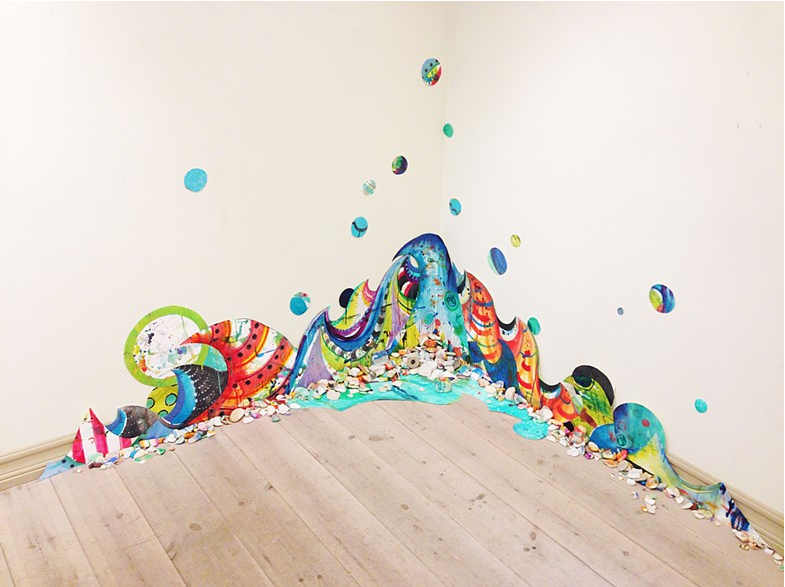
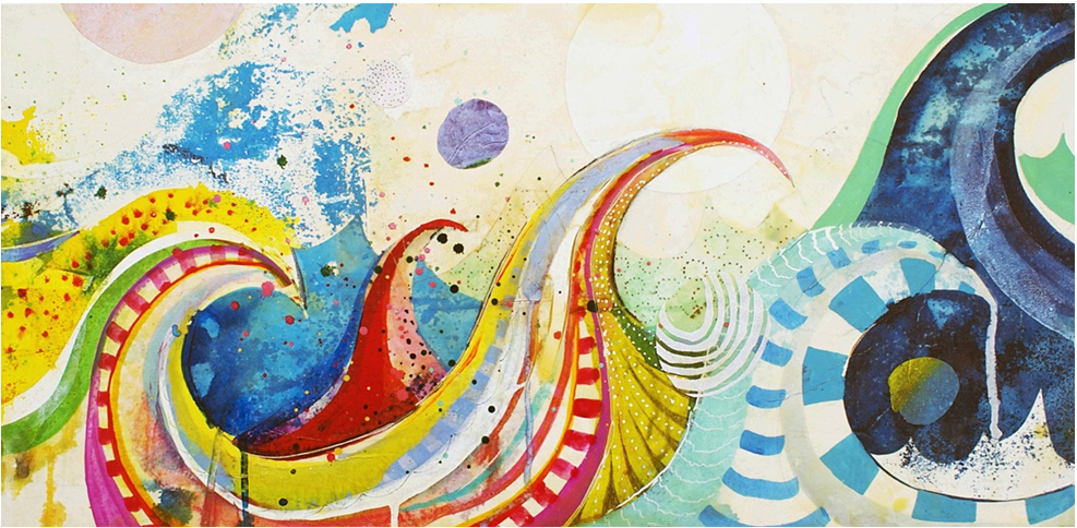
I decided I needed to try something new. I wanted to move away from the use of watercolor and charcoal and transition into acrylic paint. My idea for this piece was to shift from realistic painting and begin working abstract. This was a challenge for me because I had been doing the same type of paintings for a couple of years.
I chose my color palate simply by painting with the colors of my room. With experimentation, I used various materials such as pool noodles, doilies, string, and dice to leave imprints with the paint.
Many classmates and peers think I should continue moving in this direction to make my next works.
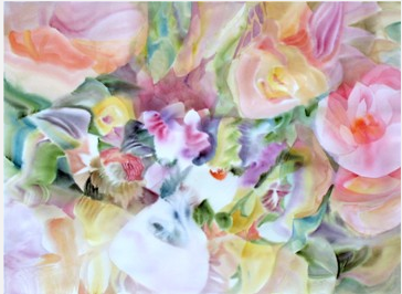
When it became time to complete summer work, I decided I wanted to try a bunch of new things and gave it my all. I am aware that over the past I went for the easy stuff. I painted flowers and fruit because I thought they were pretty and enjoyed the painting process. These prior images represented happiness, joy and the lighter side of life. Being in Art 5, I took the time over the summer to gather materials and plan out the meaning behind my work and what it would look like.
I have invested the most time in this work than I ever have before. I realized that even though it is good to make work purely for enjoyment, I needed to expand and make work that had a connection to me and my life. I did not wait until the last minute to start my summer work, it took me about a month total, to create the paper canvases, paint with watercolor, and redo the image solely using chalk.
In all honesty, the most difficult part of all my work is knowing what to create. I typically try new things until I find something I enjoy doing and just stick with that. So, realizing I was ready to create something new but still using the same watercolor techniques was difficult for me.